Percentiles, Histograms, and Distributions
Percentiles give you a deeper insight into how your system is behaving. For example, if your application’s response latency is very low 94 times out 100 but very high for the remaining 6 times, your average latency will still be low but it won’t be a great experience for your users. In other words, this is the case where your 95th percentile latency is high, even though your average and median (50th-%ile) latency is very low.
A typical way to measure percentiles from continuous monitoring data, which you may have to aggregate across various sources, is to use histograms (also called, distributions). In a histogram, you assign the incoming data points (samples) to pre-defined buckets. Each data point increases the count for the bucket that it falls into; data point itself is discarded after that. You can take a look at the bucket counts at any point of time and get an estimate of the percentiles. Histograms make it easy to aggregate data across multiple entities, for example, from probes running on multiple machines.
Following diagram shows distribution of latencies into 9 equal sized histogram buckets:

(Above diagram shows histogram for the following samples: 5.1, 6.2, 9.0, 12.1, 8.3, 9.7, 9.4, 10.3, 14.1, 11.2, 16.6, 9.9, 10.6, 14.1, 0.9, 7.1, 17.7)
Histograms in Cloudprober (Distributions)
Cloudprober uses a metric type called ‘distribution’ to create and export histograms. Cloudprober supports creating distributions for probe latencies, and for metrics generated from external probe payloads. To create distributions, you have to specify how the data should be bucketed – you can either explicitly specify all bucket bounds, or use exponential buckets type which generates bucket bounds from only a few variables.
Here is an example of using explicit buckets for latencies:
probe {
  name: "..."
  type: HTTP
  targets {
    host_names: "..."
  }

  latency_unit: "ms"
  latency_distribution {
    explicit_buckets: "0.01,0.1,0.15,0.2,0.25,0.35,0.5,0.75,1.0,1.5,2.0,3.0,4.0,5.0,10.0,15.0,20.0"
  }
}
Configuring distributions
As seen in the example above, for latencies you configure distribution at the probe level by adding a field called latency_distribution. Without this field, cloudprober exports only cumulative latencies. To create distributions from an external probe’s data, take a look at the external probe’s documentation.
Format for the distribution field is in turn defined in dist.proto.
// Dist defines a Distribution data type.
message Dist {
  oneof buckets {
    // Comma-separated list of lower bounds, where each lower bound is a float
    // value. Example: 0.5,1,2,4,8.
    string explicit_buckets = 1;

    // Exponentially growing buckets
    ExponentialBuckets exponential_buckets = 2;
  }
}

// ExponentialBucket defines a set of num_buckets+2 buckets:
//   bucket[0] covers (−Inf, 0)
//   bucket[1] covers [0, scale_factor)
//   bucket[2] covers [scale_factor, scale_factor*base)
//   ...
//   bucket[i] covers [scale_factor*base^(i−2), scale_factor*base^(i−1))
//   ...
//   bucket[num_buckets+1] covers [scale_factor*base^(num_buckets−1), +Inf)
// Note: Base must be at least 1.01.
message ExponentialBuckets {
  optional float scale_factor = 1 [default = 1.0];
  optional float base = 2 [default = 2];
  optional uint32 num_buckets = 3 [default = 20];
}
Percentiles and Heatmap
Now that we’ve configured cloudprober to generate distributions, how do we make use of this new information. This depends on the monitoring system (prometheus, stackdriver, postgres, etc) you’re exporting your data to.
Both prometheus and stackdriver support computing and plotting percentiles from the distributions data. Stackdriver can natively create heatmaps from distributions while for prometheus you need to use grafana to create heatmaps.
Stackdriver (Google Cloud Monitoring)
Stackdriver automatically shows percentile aggregator for distribution metrics in metrics explorer (example). You can also use Stackdriver MQL to create percentiles (see stackdriver documentation for other usages of MQL for cloudprober metrics):
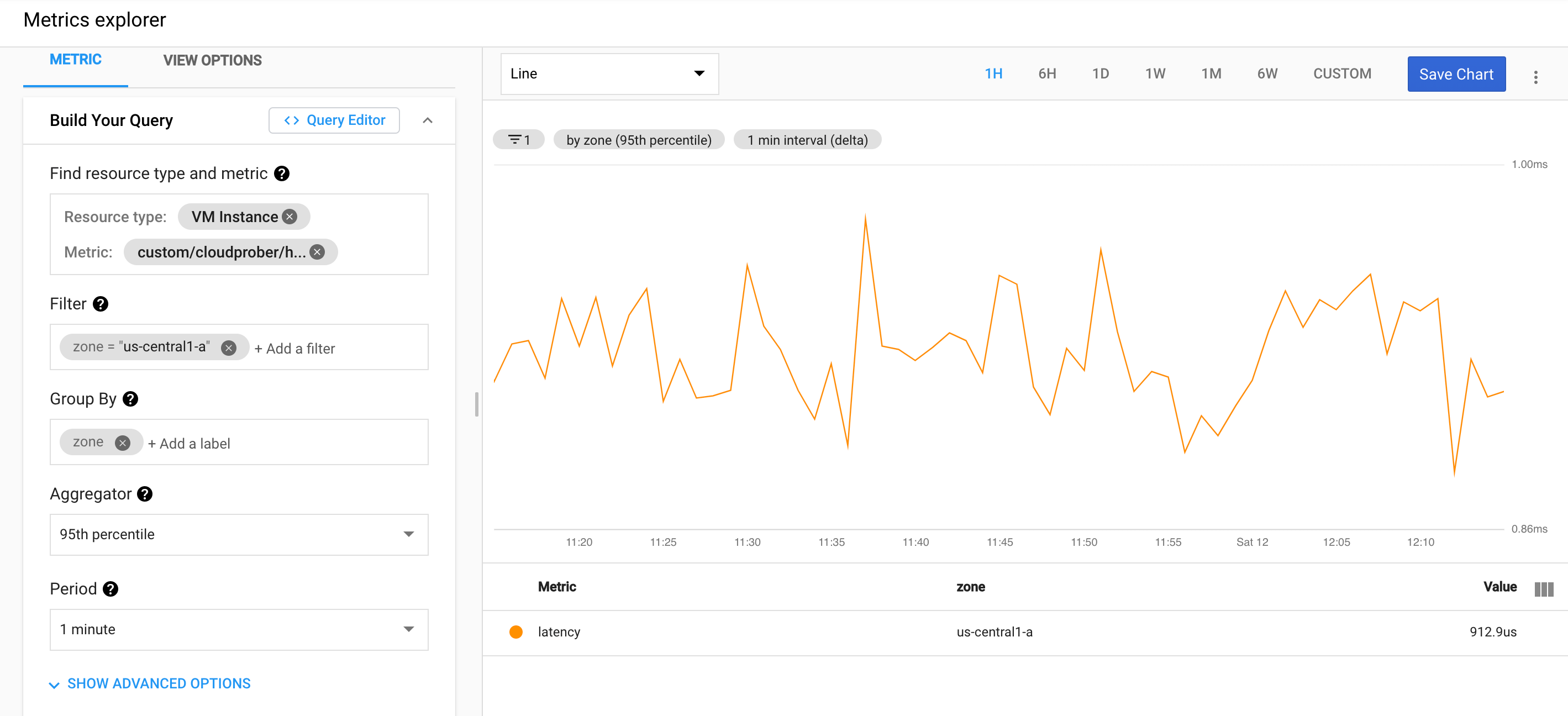
fetch gce_instance
| metric 'custom.googleapis.com/cloudprober/http/google_homepage/latency'
| filter (resource.zone == 'us-central1-a')
| align delta(1m)
| every 1m
| group_by [resource.zone], [value_latency_percentile: percentile(value.latency, 95)]
Stackdriver has detailed documentation on charting distributions.
Prometheus
Cloudprober surfaces distributions to prometheus as prometheus metric type histogram. Here is an example of prometheus metrics page created by cloudprober:
# TYPE latency histogram
latency_sum{ptype="http",probe="my_probe",dst="hostA"} 77557.14022499947 1607766316442
latency_count{ptype="http",probe="my_probe",dst="hostA"} 172150 1607766316442
latency_bucket{ptype="http",probe="my_probe",dst="hostA",le="0.01"} 0 1607766316442
latency_bucket{ptype="http",probe="my_probe",dst="hostA",le="0.1"} 0 1607766316442
...
...
latency_bucket{ptype="http",probe="my_probe",dst="hostA",le="75"} 172150 1607766316442
latency_bucket{ptype="http",probe="my_probe",dst="hostA",le="100"} 172150 1607766316442
latency_bucket{ptype="http",probe="my_probe",dst="hostA",le="+Inf"} 172150 1607766316442
Fortunately there is already a plenty of good documentation on how to make use of histograms in prometheus and grafana:
- Grafana blog on how to visualize prometheus histograms in grafana.
- Prometheus documentation on histrograms.